🎨 The Story Behind the Visuals
After completing the initial version of Online Photo Gallery, I needed to sync the project to GitHub. Beyond the lines of code, I realized the project needed "visual packaging" to truly stand out. I've always believed that great design starts with imitation, so I decided to recreate the iconic Apple aesthetic for my project showcase.
🛠️ Choosing the Tools: From Shortcut to Customization
Initially, I tried using Shots.so, an online mockup generator. It turned out to be a case of "being too clever for my own good" 😈—what was meant to be a quick shortcut ended up costing me hours without achieving the right look.
- Layout Constraints: While Shots.so offers beautiful presets, it struggled with the specific layering I wanted for the MacBook and iPhone on a single canvas.
- Limited Creative Freedom: The tool is great for speed, but its fixed patterns stifled the specific vision I had for the composition.
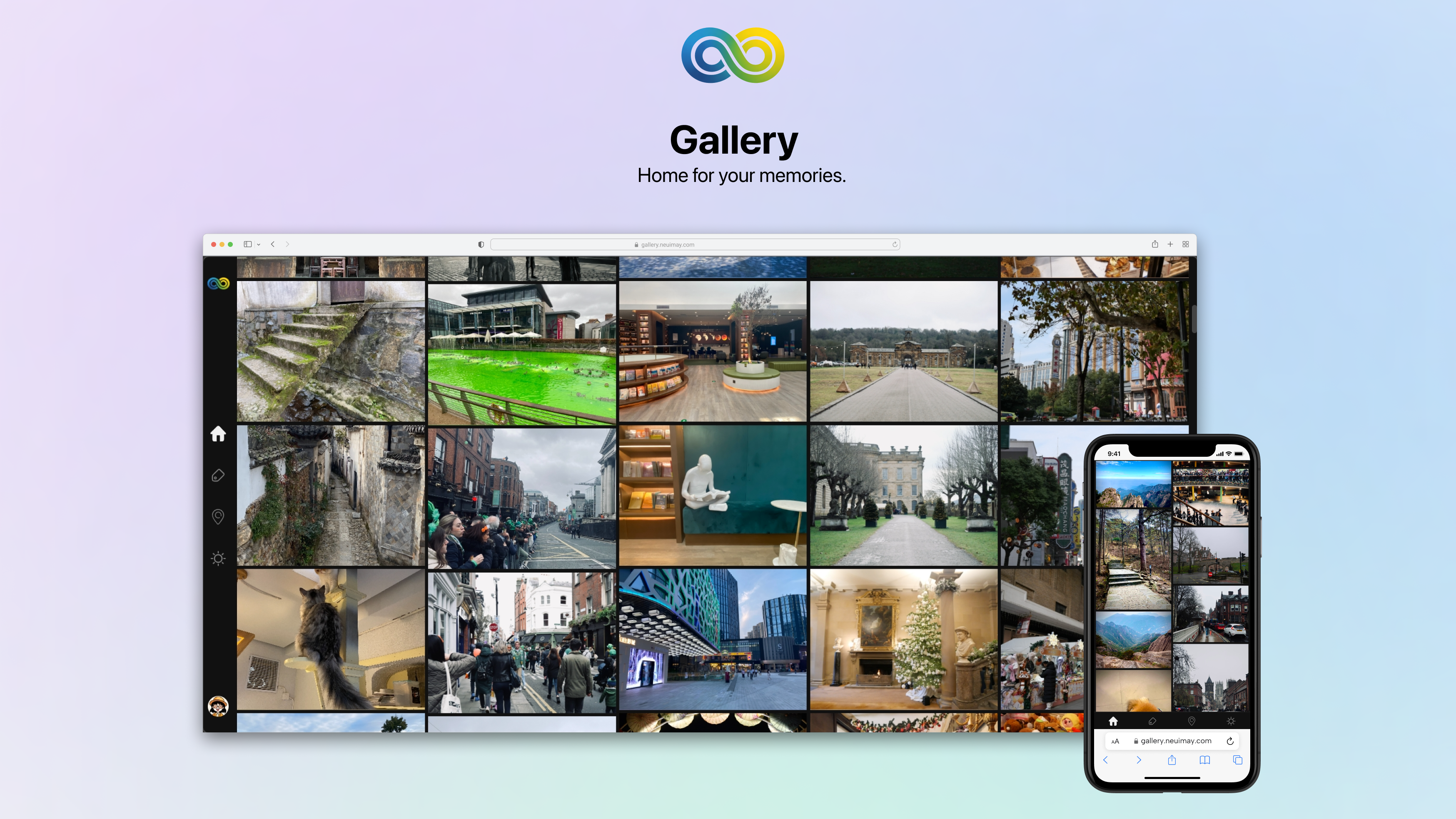
1. Crafting the iOS-style Mesh Gradient
To capture that high-end Apple "color collision," I used a technique of layering organic shapes and then "smudging" them manually using Layer Blur.
- Color Palette: I opted for a "Muted Modern" palette (Misty Lavender
#E0C3FC, Sky Blue#8EC5FC, and Mint Green#C2FFD8). - The Layering Technique:
- I started with a light base color (
#F5F5F7) and drew several irregular circles. - I applied a Layer Blur value of
2000to the color blocks, allowing them to melt into a seamless, ethereal background.
- I started with a light base color (
2. Multi-Device Mockup Arrangement
Switching to Figma gave me the freedom to use high-fidelity components and manually adjust the spatial relationship between devices:
- Visual Focus: Positioned the MacBook centrally in the background with the iPhone in the right foreground to create a sense of depth.
- Refining Details: Added subtle
Drop Shadowsto the mockups to simulate devices floating elegantly in space.
3. Composition & Typography
I chose a classic vertical alignment to guide the viewer's eye: Project Icon -> Main Title -> Subtitle -> Device Showcase. This hierarchy builds brand recognition through the icon, captures intent through text, and finally showcases the experience through the mockup.
- Typography: Used
SF Pro Display(Bold) for the title andSF Pro Text(Regular) for the subtitle. - Copywriting: I chose the slogan
Home for your memories.The period at the end provides a sense of "finality"—much like the click of a shutter, giving the word "memory" its due weight.
🚀 Final Result
This was actually my first time using Figma. Despite its fame, I had never properly sat down to learn it. However, thanks to a background in Photoshop, I was able to get the hang of it within a few hours. That said, truly mastering the professional nuances will definitely take some more time and exploration 🌟.